Krudmart is a Buffalo New York-based e-tailer and street lifestyle website. While Magento is their e-commerce platform of choice, they wanted to upgrade some of the stock buttons and images that came pre-installed with something that fits in a little better with the aesthetic they’ve worked hard to develop. But skinning new buttons was just a small part of the larger project to make the site more customer and search engine friendly.
Although the site boasts loads of great content (mostly linked to from the homepage), it wasn’t well-organized and didn’t have a sense of hierarchy or direction. Everything screamed out to be clicked. Reorganization of the content on that page was designed to focus more on product sales (and featured products) and minimize the draw of the additional content (blog, polls, etc) which is secondary to the purpose of the site.
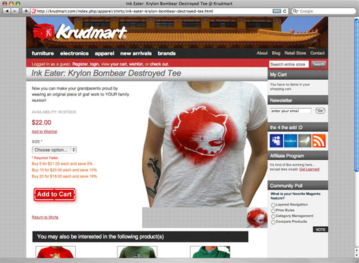
Product pages also lacked clear calls to action (adding to cart) so the redesign of those buttons focused on making them more prominent and noticeable. Customers would also become confused after attempting to add a product to their cart because confirmation messaging appeared at the top of the page; often not visible after they had scrolled down to read product descriptions. This messaging was moved to directly above the ‘Add to Cart’ where it was more obviously associated with the action on the button (and also always visible). A subtle fading (to white) background animation was also added to attract attention.
Like the homepage, the shopping cart itself was cluttered with lots of content and options, and the buttons were not designed or placed where they stood out. There also wasn’t any real difference in the appearance or location between the buttons for the primary action (checking out) and secondary actions like editing the cart or viewing related products. Along with creating a noticeable difference in the size and locations of the buttons for our primary focus (getting the customer to checkout), the layout of the shopping cart was also simplified to make it easier to use and digest the information contained in it.
In addition to layout changes on the homepage, product pages, and checkout process pages, underlying HTML code was modified to be more semantic and meaningful to search engines.
Lance and I were very happy with work that you did. We have nothing but positive things to say about your work ethic and we were very happy with the results. We saw a positive sales increase immediately. Thank you for your service as well as your dedication to our project. We certainly will be calling you for any future work. Thanks from Krudmart!-Christina Vinci
